

















SUN Zero Redefining Premium Water Through Bold Contemporary Pack

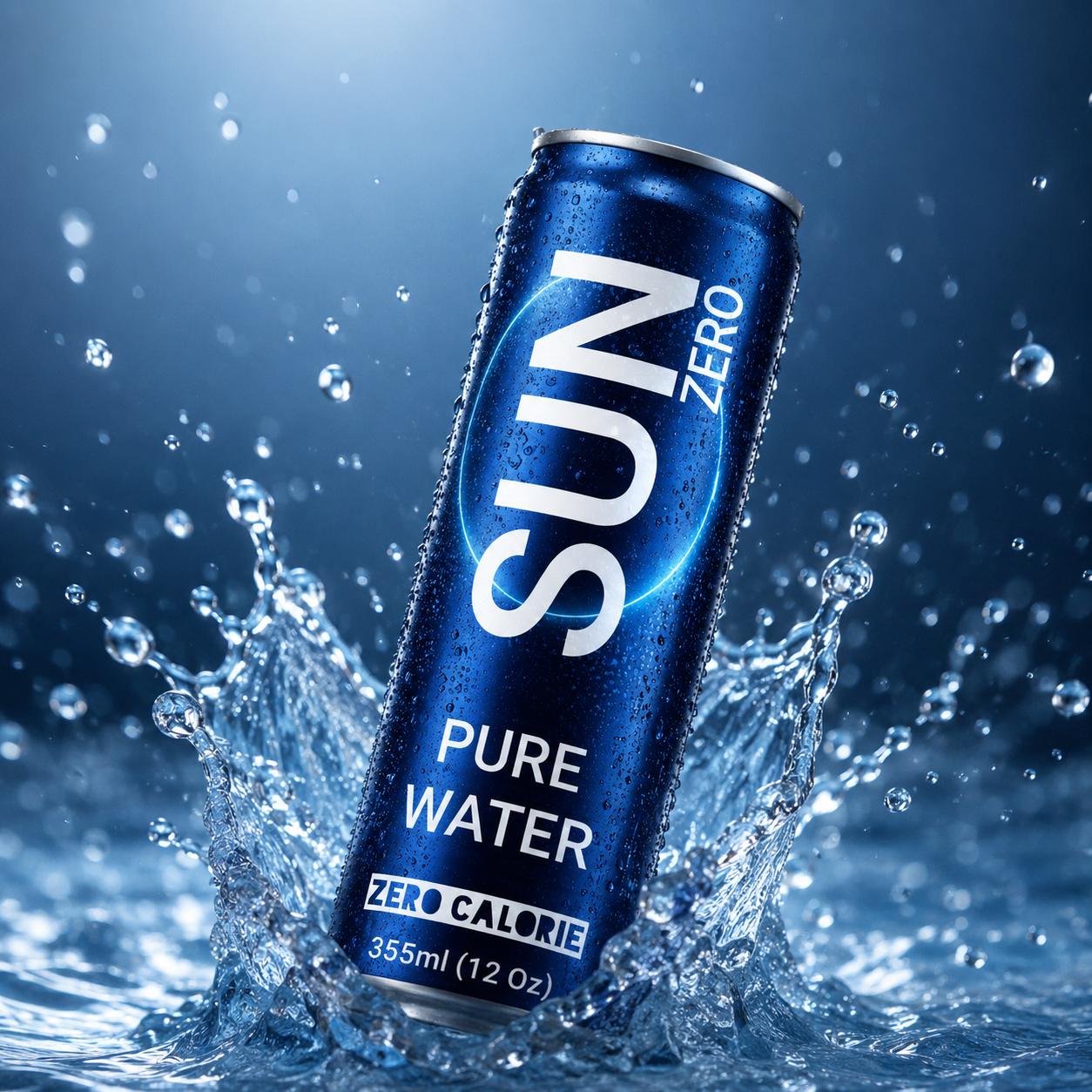


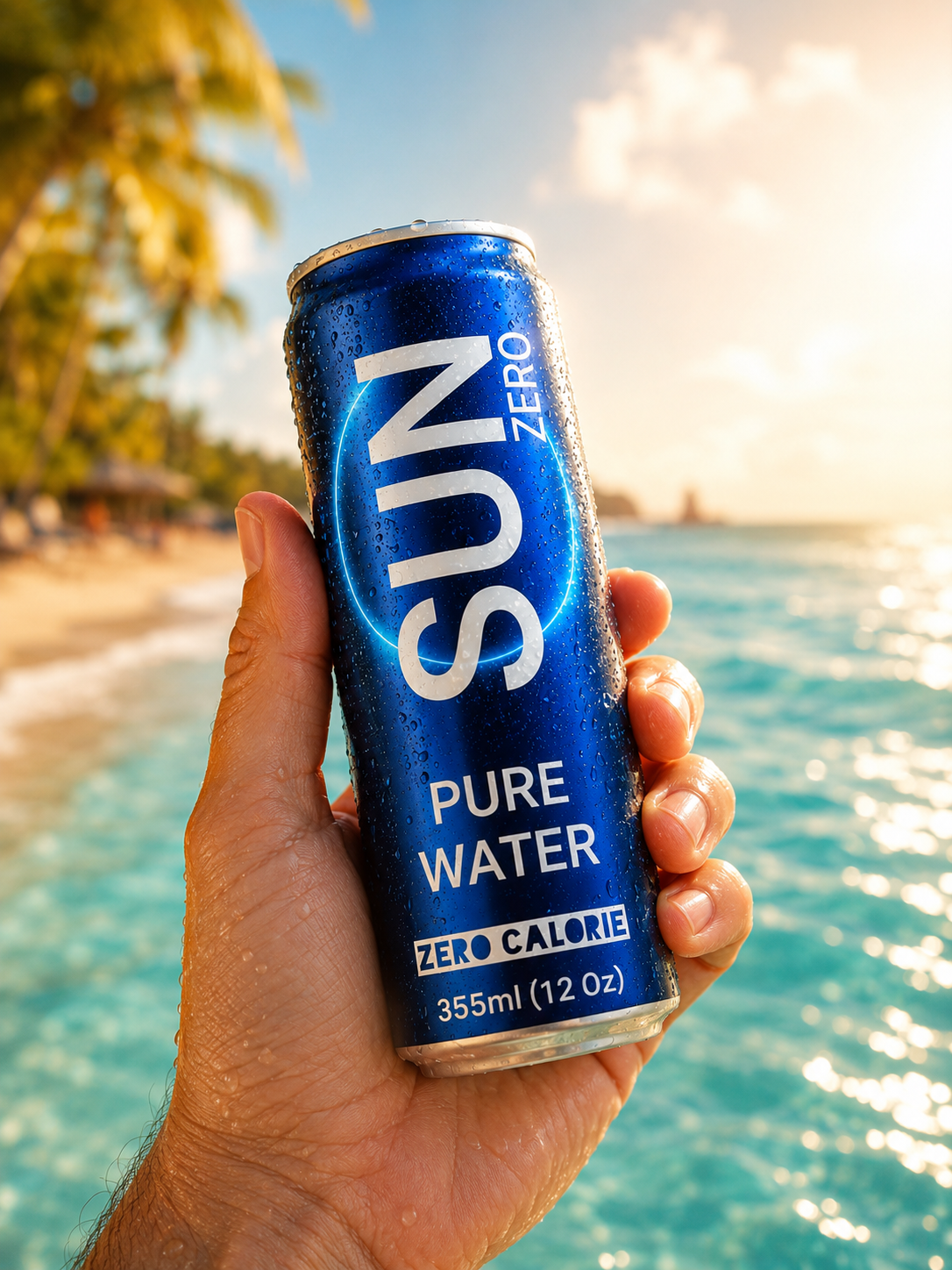

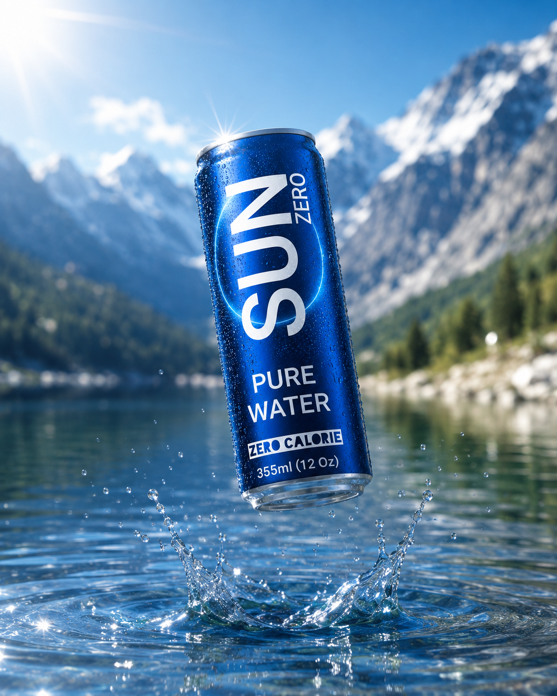


In a market where most bottled water brands look alike, SUN ZERO is a conceptual visual identity project that reimagines the idea of pure drinking water from a contemporary perspective.
The packaging evolves from being simply a container into a visual element that reflects a modern lifestyle, combining simplicity with sophistication.
The identity is built around a slim aluminum can finished in a deep cobalt blue, symbolizing coolness, purity, and depth. A glowing circular graphic represents energy, the continuity of life, and the clarity of water.
The design relies on clean typography and a minimalist visual composition, giving the brand an immediate presence that is distinctive, memorable, and easy to recognize.
Materials Aluminium, Foil bags
Year 2026
Country Sudan
Region Africa, Asia
Project type Conceptual Design
Client Personal Project
More by Mohammed Nasr Sharfi View profile

 Boulevard Punch – A beverage inspired by graffiti street art

 SHERBET SHAKE — HIBISCUS | Bold Energy Drink Packaging

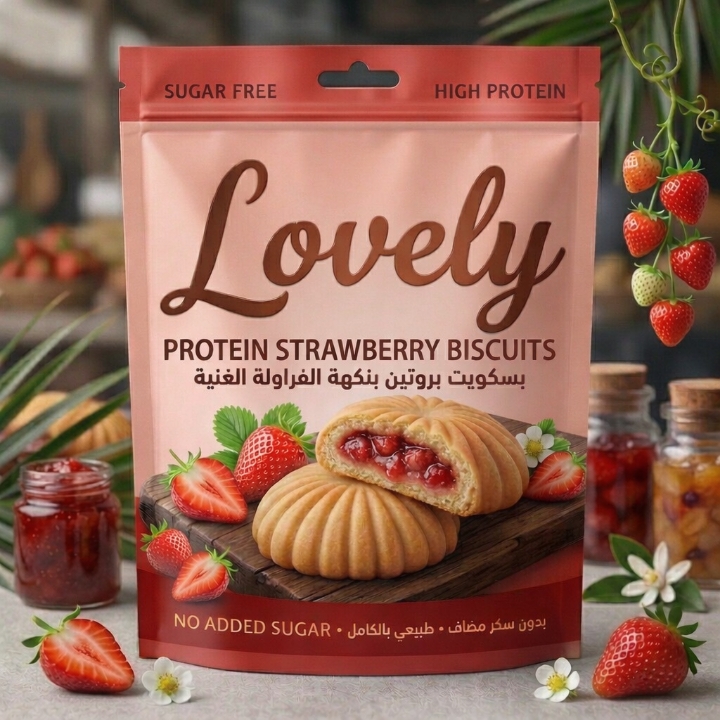 Lovely Protein Biscuits: A Minimalist Functional Packaging

 Oraska – A Refreshing Identity Inspired by Fruit and Lifestyle

 Epsilon Energy Drink

 LokaLuly Performance Nutrition: A Premium Natural Fuel Solution

 VitaminAde Sports Drink

 Striptos Gum Sugar Free