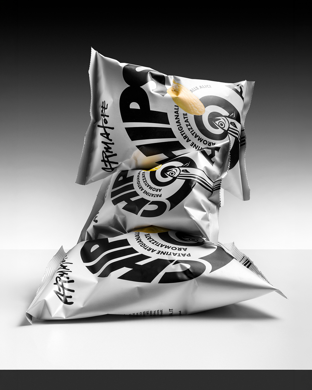
Armatore Core Line


For years we have been building with Armatore, the anchovy and preserved fish company from Cetara on the Amalfi Coast, a visual universe that interprets the culture of the sea through different languages and expressive registers.
With the restyling of the Core line, the evolution of the historic Lo Zingaro di Mare range, we faced a new challenge: bringing order, consistency and recognisability to a range of tuna, anchovies and their variations that had grown over time, without giving up the brand’s artisanal character and personality.
This led us to leave behind the more symbolic representations of the maritime world and look for a more essential language, one that finds its narrative strength in the product itself.
Nature before symbols
The starting point was a change of perspective: no longer telling the sea through its symbols, but observing what lives in it.
The movement of the fish, the way they gather in shoals and the rhythm with which they cross space become the narrative and compositional principle of the new collection.
A direct look at what the product tells, rendered with an instinctive and deliberately irregular illustrative stroke that conveys the vitality of the subject without losing the personality of the drawing.
The poetics of the shoal
The shoal becomes a dynamic visual system, in which repetition, changes of scale and movement build ever-different compositions.
The illustrations run across the entire surface of the label, going beyond the traditional distinction between front and back and turning the packaging into a continuous narrative space. The cylindrical shape of the jar amplifies this intention: the movement ideally continues along a circular surface, evoking the endless flow of marine life.
A visual intuition translated into a rigorous graphic system, where composition, typography and colour accents organise the range and make each product immediately distinguishable.
Instinctively Armatore
The search for simplicity does not mean giving up expressiveness. The illustrated mark, the materiality of the paper and the texture inspired by fishing nets, which also features on the lids, build an authentic and recognisable language that preserves the brand’s craft soul.
A balance between order and expressive freedom that enhances each product and gives the collection a new overall identity, designed for specialty food stores, e-commerce and the horeca channel.
The result is a restyling that renews the language of the Core line without breaking the dialogue with the past: a project that finds a new visual principle in the observation of nature.
Pentawards 2026: Gold Award, Fish, meat and poultry.
Curator’s Insight
The system works because the illustration does the sorting. Anchovies appear small and numerous, while the tuna are fewer and larger, so the scale of the drawing hints at the size of the fish before the label is read. Colour is kept to a single accent per variant: olive green for oil, pale blue for salt, orange for the belly cut. The hand-circled “in olio di oliva” feels like a pen mark made at the table. Against this looseness, the angular capitals of the wordmark sit firmly at the base of every label and give the eye a fixed anchor. When a range grows by accretion, one rigid element and one fluid element, each with a clear job, can bring order without flattening the character.
The netting on the cap is where the concept closes. The label is full of loose, moving fish, and the lid supplies the thing that catches them: a tight, regular mesh drawn in the same black line, printed over metal so it shimmers as the jar turns. It is the only part of the pack that is rigid and geometric, which makes the hand-drawn shoal below look freer by comparison. The pattern also gives the range a signature from above, so on a shelf or in a stack the family reads before any text does. It is a small gesture, but it tells the story of the catch without adding a single extra symbol to the label.