Zig Nuts & Dried Fruit




Zig has been selling nuts and dried fruit in Italy for decades, in a category where people choose by price per kilo and brands stay in the background. Our brief to ourselves was simple: turn a commodity into a companion, a small spark for the everyday break.
The answer was waiting in the company archives. The original 1967 Zig logotype, fluid and a little imperfect, was redrawn for today without losing the character that made it feel human. Around it we built a visual and verbal system that balances joy and structure: natural tones lifted by lively accents, everyday photography and short animations that give the brand a rhythm.
Four themes, #zigbreak, #momentozig, #socializig and #guizzozig, follow the moments of the day when people reach for a handful of nuts: a pause at work, a moment alone, something to share. They drive copy and imagery across packaging, social and retail.
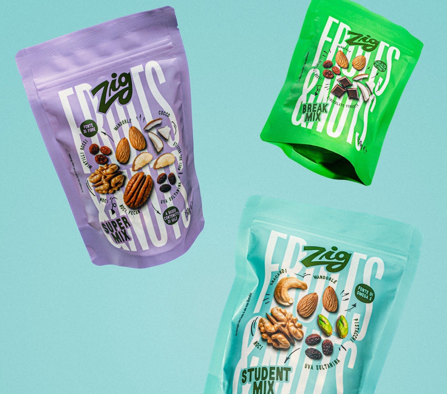
The Fruits & Nuts line is the first to carry the new identity on shelf.