

















Redesign of Hummingbird Coffee: dynamics and rapidity

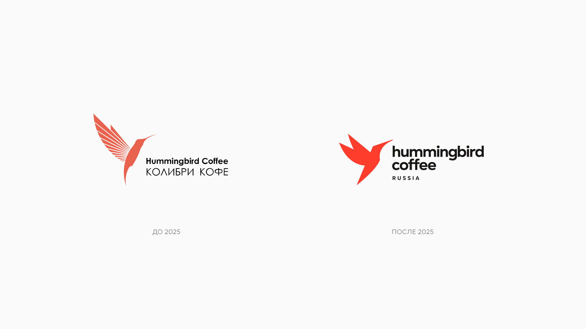



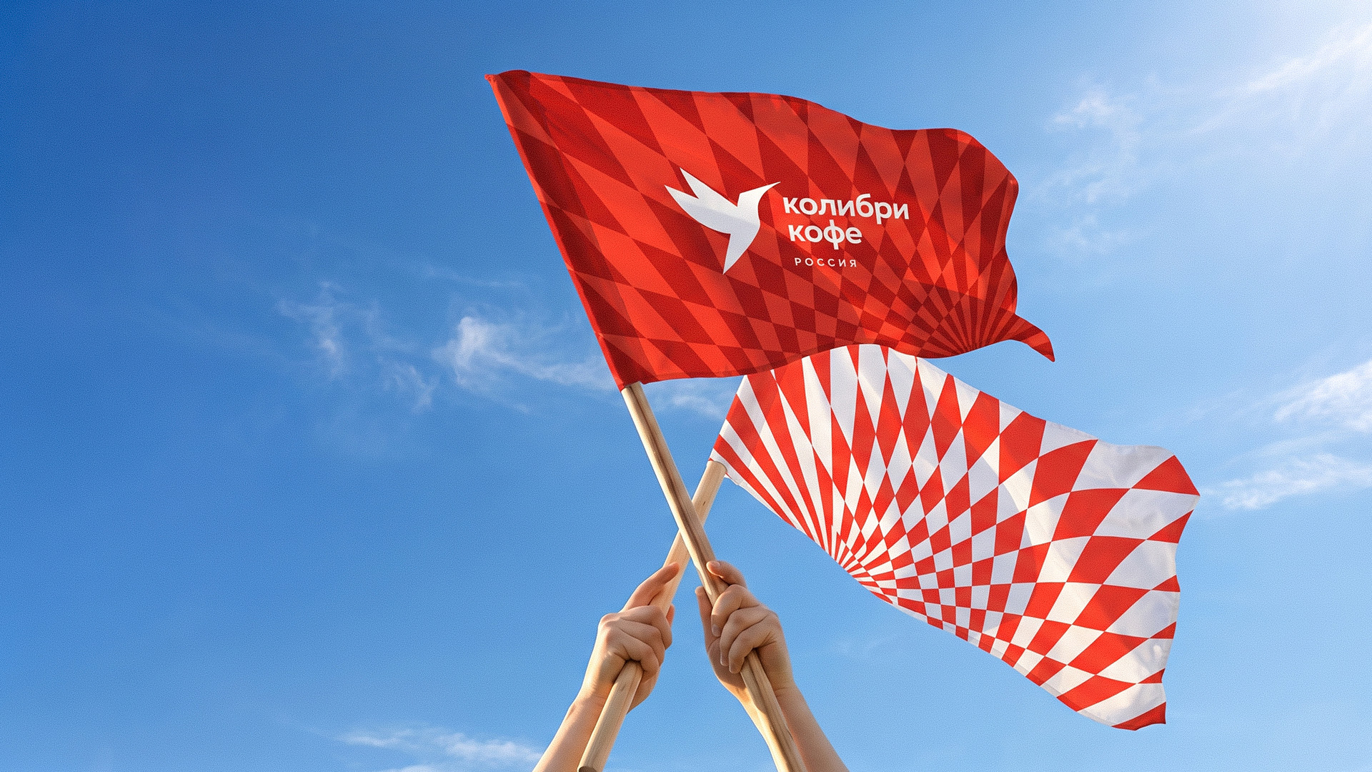

Hummingbird Coffee has been a Russian importer of coffee beans since 2011. The company invests in the development of the coffee industry and education, creates digital tools for evaluating the taste of coffee, builds direct and long-term relationships with farmers, and is a driver of new coffee varieties and growing regions in the Russian market. Over the years, the brand’s previous visual identity has stopped reflecting the company’s energy and scale.
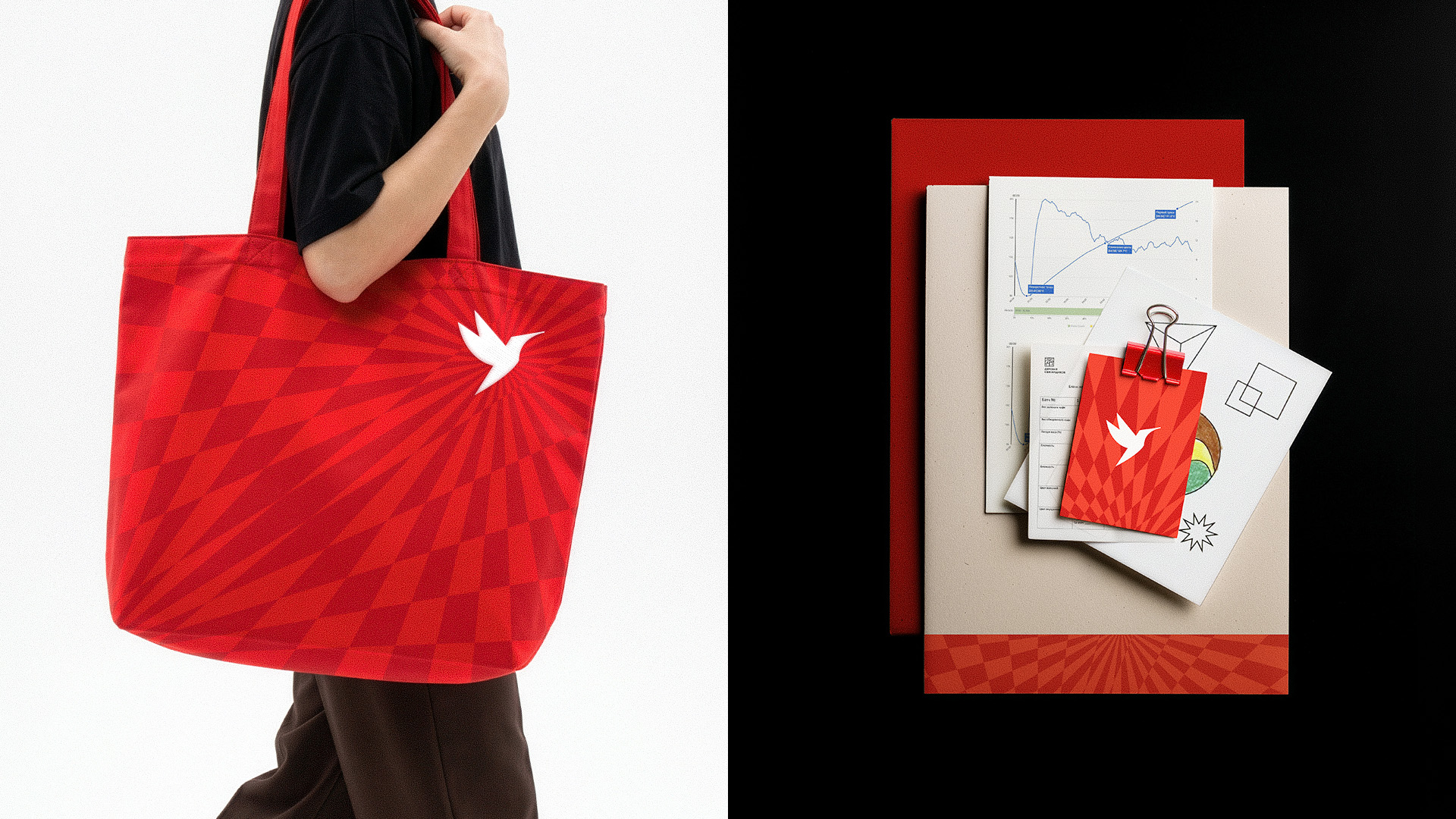
Exploring the image of a hummingbird, we found the main metaphor. The hummingbird is a small but incredibly fast and strong bird. The speed of reaction, dynamics and rapidity are what the company shares with its symbol, the hummingbird bird. This metaphor formed the basis of a new visual language.
More by Ohmybrand View profile

 Tyoma: comfort and care in everything

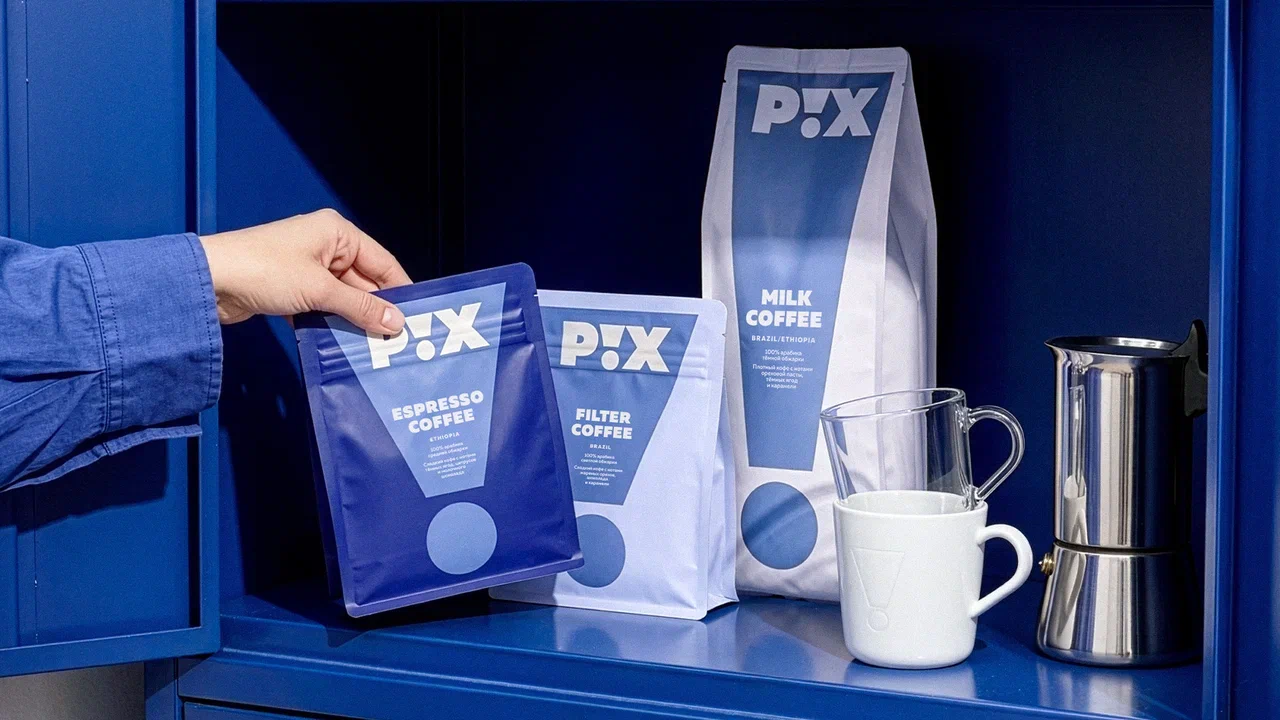 PIX Coffee: a good day starts with good coffee

 Delicious all year round: seasonal limited‑edition “Pyaterochka

 Fish&More shrimp in sauce: bright & vibrant

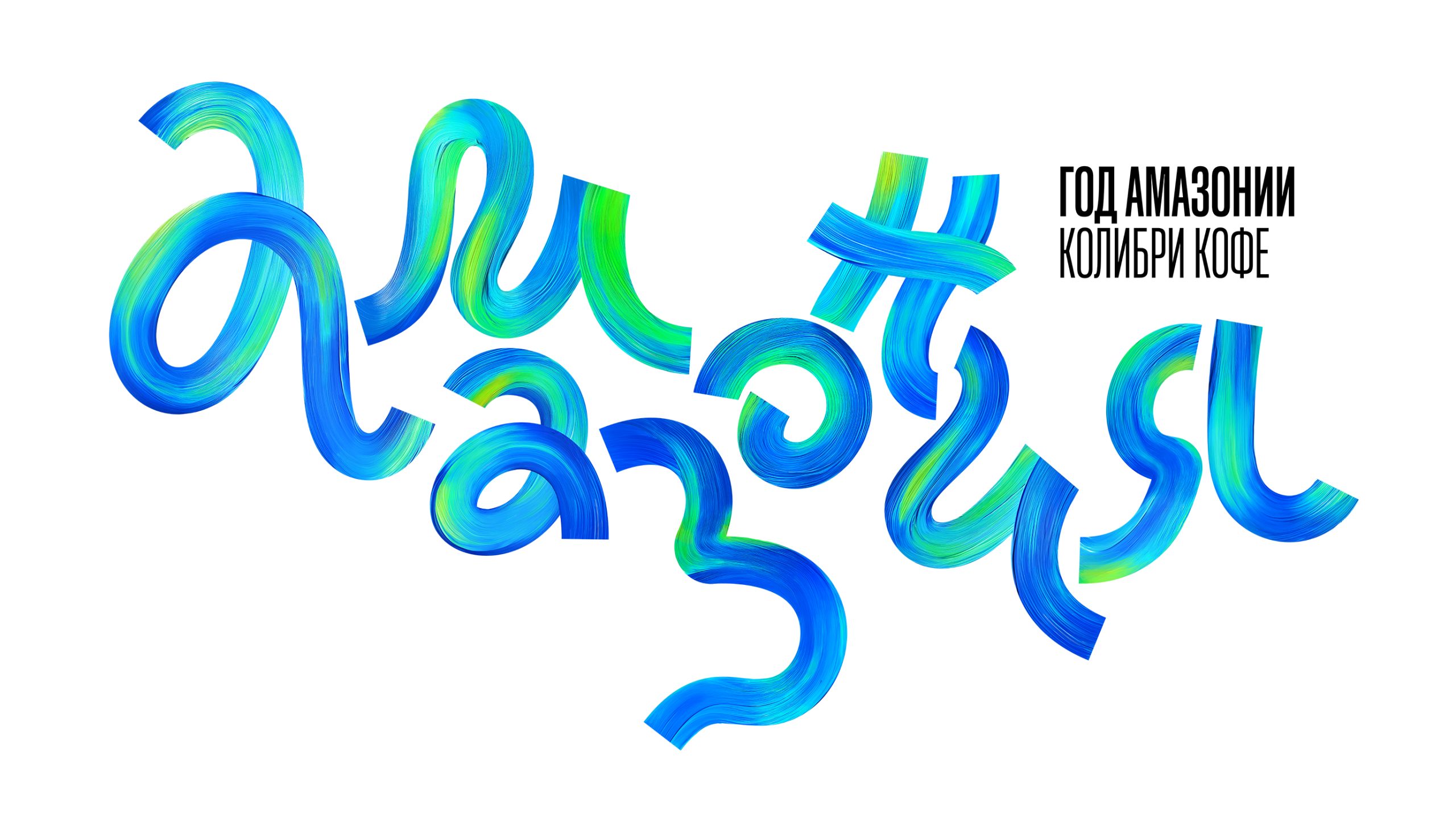 Amazonia Year 2025 (Hummingbird Coffee)

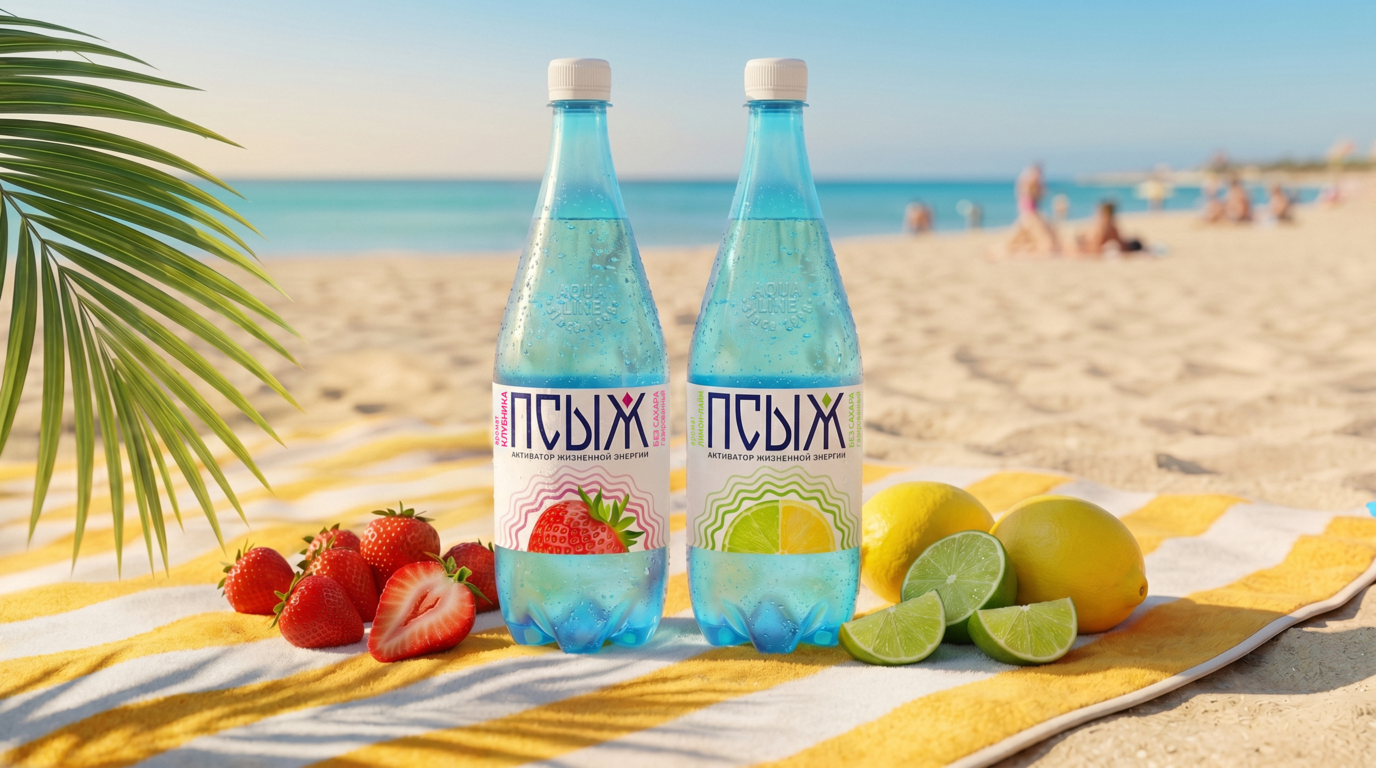 Waves of Vitality: Flavored Water Design and Bitters

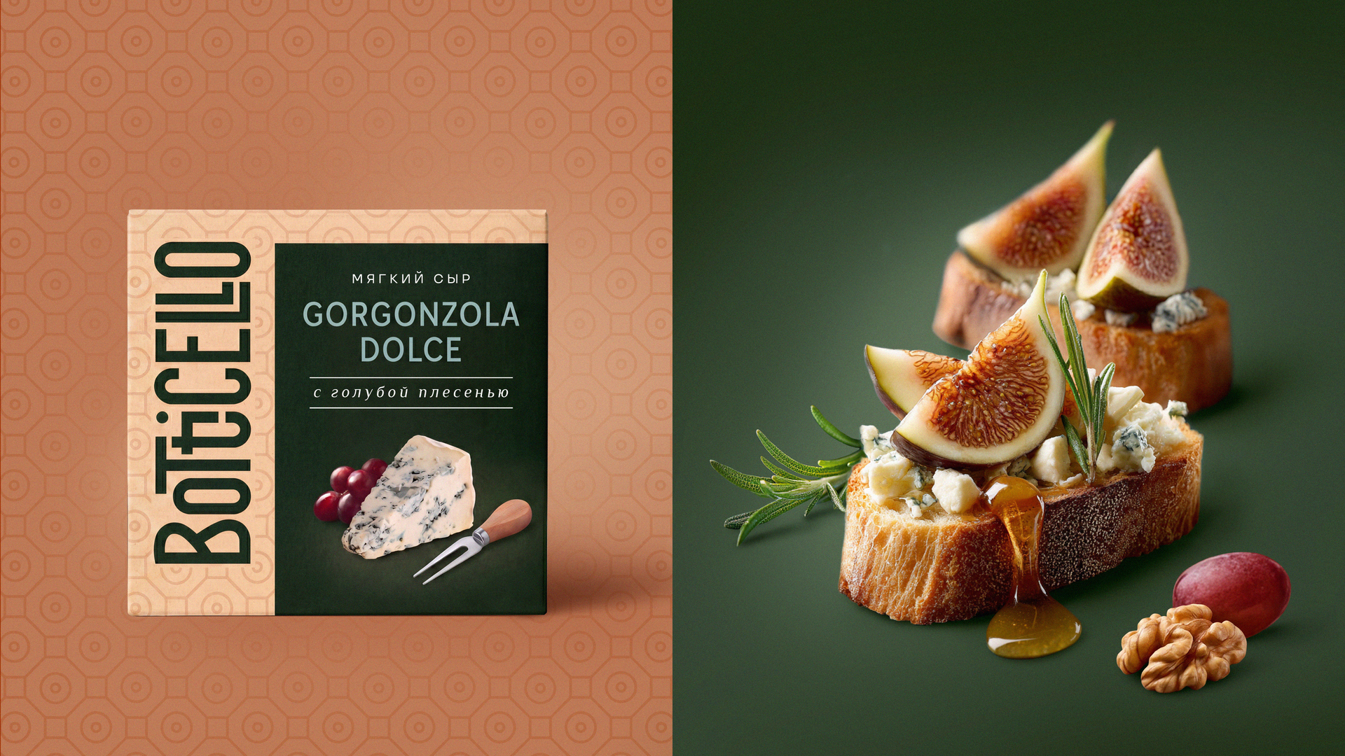 Inspiring Delight: A Package of Italian Cheese

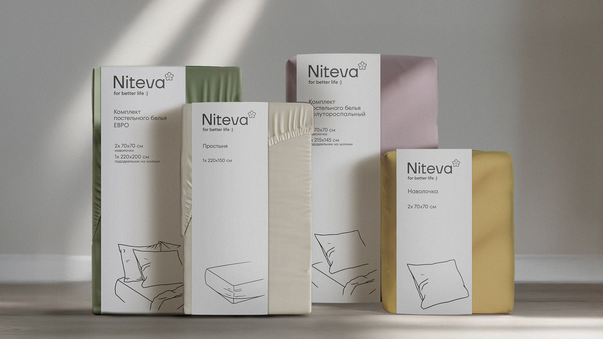 Niteva bedding brand